
As some of you may know, I recently started up HireHumanArtists.com, a directory spreadsheet of artists who have pledged to never use gen AI while creating their works. This comes with a small caveat: someone has to review all of the submissions to see if any immediately identifiable gen AI is present in the artist portfolios. Thankfully, I have help. There’s a small group of us going through the “slush pile” of artist portfolios submitted. Still, to keep confidence in artists on the list high, we ask for a voting consensus of four people to approve each applicant at the least. Currently, there are 344 artists on the list (and growing). I’ve looked at the vast majority of the portfolios sent in, and I thought I’d note what I’ve learned, what I’ve seen, and what you may want to take away from all of these portfolios I saw.
The Positive: Things Artists Do – You should do these
I’ve seen a lot of positive things artists provide in their portfolios to not only make them useful, but also entertaining. It’s hard sometimes getting sucked into the beautiful art and spending a long time appreciating all of the gorgeous creations. Here’s what most artists are getting right:
Limited curation on the front page
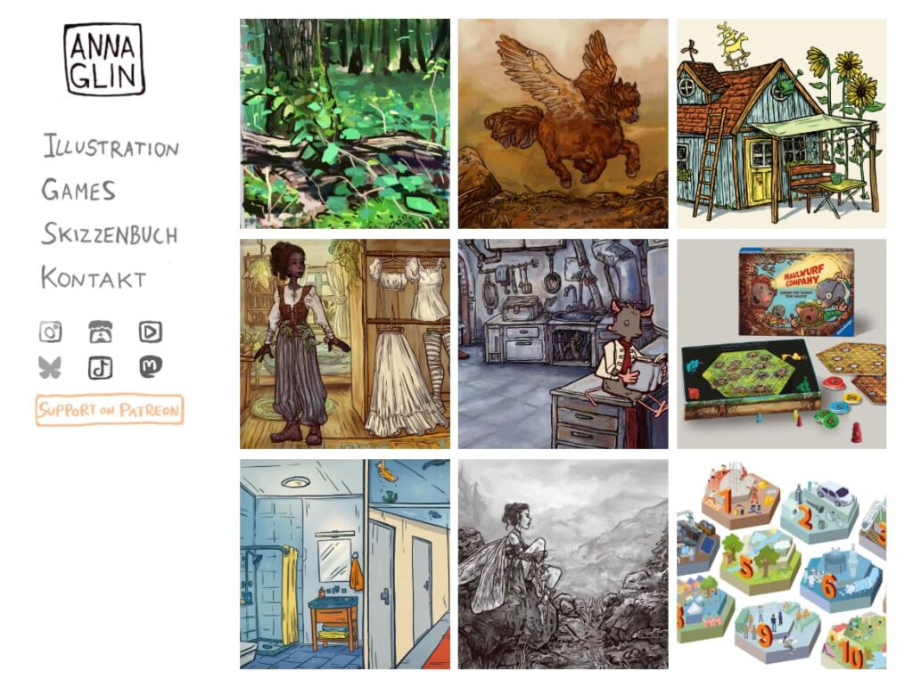
Offering a limited selection of your favorite/strongest artworks on the front page helps people get a vibe on your works immediately, without having to jump through hoops to get there. This invites people to look deeper by hooking them with your artwork right away.
Don’t:
- Place just one large image. It can feel really enticing to put a “cover photo” image up, or a video or a slider. I found I liked it the best when I had full control over the artworks I was looking at and could zoom in on them or click on them at will.
- Place just a handful of images. Try to aim for somewhere between 12 and 20 artworks to show right off. Don’t place an endless scroll of images either. I try to get to the footer of most sites to find social media links, and endless scroll makes that take a long time to get to.
Separate galleries for major categories/types/styles
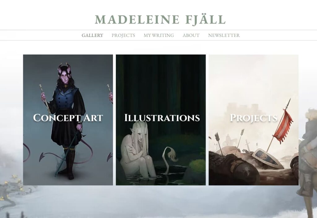
Artists seldom stick to one thing and often stretch their skills across multiple categories. Whatever those categories might be, spread them out into separate galleries. For example, you may have concept art, sequential art, and illustrative works. Make a gallery for each!
Don’t:
- Overload the visitor with too many categories. Stick to a small handful of your major ones, especially if you plan to place them on the main navigation.
- Make up your own terms. Try to use industry standard lingo so people know what to expect when they’re clicking on those galleries.
Make artworks big and crisp
Whether you’re placing your image inline on a page or having it open in a light box, make sure that your images are not tiny and not low-resolution. Aim to have artworks sized to 1200-1500px on the longest dimension, and make sure they’re nice and crisp to view. If you convert to jpg before posting, try for a jpg that doesn’t have too many visible compression artifacts but isn’t too large file size-wise.
Don’t:
- Forget to scale your images. Bigger is not always better, and providing your high resolution images for free off your website means anyone can print those or do something else with them. Protect your assets by creating web ready versions with watermarks, Glaze/Nightshade, and scaling them appropriately.
- Make your images too large in the file size. You’re asking the visitor’s browser to load 20+ of these at any point. If they’re each 10 mb, that’s 200 mb of data you’re asking a visitor to download quickly (page speed matters). Try to hit that sweet spot of not too big, but not visibly degrading the artwork with compression either.
Label everything
Everything’s better with labels. Here’s what you should label:
- Project title
- Project type
- Project medium
- Year completed (Please do this one!)
The Surprise: Things I loved I want to see Artists do more of
I saw a lot of really cool things while browsing these portfolios, and I’m going to be taking back some of these items to my own site and applying them.
Inline WIPs
I was super grateful when I’d go to an artist’s portfolio and there, laid out in front of me, was an array of WIPs showing the process of completing the item in the portfolio. I’ve seen static images and timelapse videos, and all of them have been excellent. They help me see the process and I can tell, for sure, if it’s a real human being making art decisions or not. Plus, it’s super interesting to look at. I’m taking this one back to my own website. Catch me putting together WIP compilations for as many works as I can!
Variation: Color Identity, Fonts, & More
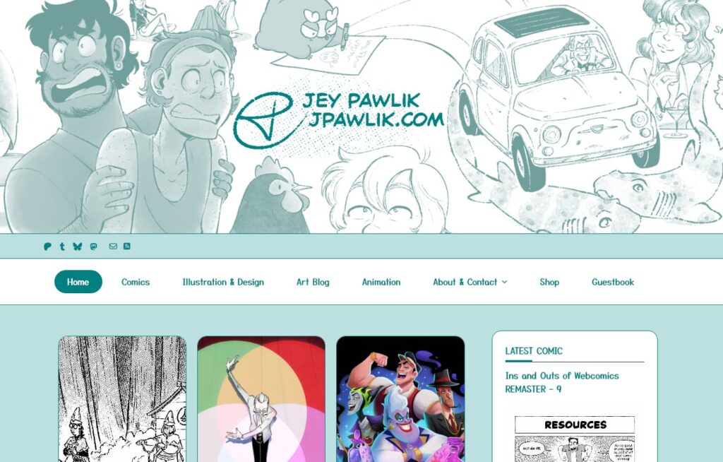
It seems like every business website is almost exactly the same, but I found so many different portfolios in so many surprising ways that I really loved. Even if it’s just changing up the colors, or using a sidebar navigation instead of a top navigation, it felt really good seeing so much variety and differentiation in artist portfolios. The internet is not completely homogenized.
The Negative: Things Artists Need to Improve
While there were plenty of good and even great portfolios, I came to a few duds, too, or even just portfolios that could use a tiny bit of spit shine to become perfect.
Splash Pages
Splash pages were all the rage back in the earlier days of the internet, but now splash pages just feel like extra clicks. If you have an “enter here” (and you’re not drawing NSFW) or some version of that, consider instead just going straight into your homepage.
Portfolios that take too many clicks
Additionally, some portfolios just have too many clicks to get to the main meat of the artwork I wanted to view. I should be able to see some artwork prior to making any clicks at all. I don’t want to be forced to select a project or artwork type before I see anything. I also don’t want to browse through all of your links on a Linktree or Carrd – I just want to see your artwork right away, as soon as possible.
Not enough artworks
I saw a few portfolios that had very limited amounts of artworks. Sometimes it was a small handful – like 3-5 artworks. This is simply not enough. Even if it’s not the most polished work you have, try to fill your portfolio with more works than that so I can get a very full picture of who you are as an artist.
Unclear contact information
Art directors (and private clients) don’t want to dig through your entire site trying to find a way to contact you. Give them an email address, a contact form, or both!
Social media accounts not easily accessible
One of the things I was doing while going through portfolios was building some starter packs on Bluesky of the artists in the directories. Problem was, there were plenty of artists who I could not find their Bluesky links… Sometimes not even any social media links at all. I know they found me via Bluesky, so there’s got to be Bluesky handles somewhere. I wasn’t going to spend a ton of time looking for their links, so I’d check sidebars (if there were any), the footer of the page (if I could get there), and then either an about page or contact page. If I couldn’t find it at any of these places, I would assume they didn’t have one and move on to the next artist.
Check links
I can’t tell you how many artist pages I’ve been to where vital links were broken. Usually, these were social media accounts, but sometimes they could be other external links. Test all your links to make sure they work! It’s super easy, just click through them from time to time. You may be gutting some of your own marketing by having dead links on your portfolio.
Images take too long to load
This is a general to-do in web design as a whole. You should be optimizing your images for display on the internet. That means not uploading the entire full resolution image to your website. It may mean reducing the size and quality as well (you can compress easily with Squoosh.app), or perhaps converting to webp or avif, if you’re savvy enough. I was coming across lots of portfolios that had assets that took a really long time to load. Long load times = higher bounce rates, so make sure to reduce file sizes as much as you feasibly can before uploading to your portfolio. I went over this shortly in the big/bold artworks area, but it definitely is worth repeating!
So much movement
So many artists are opting for a lot of scroll effects, and while these can be neat when used thoughtfully, I started getting dizzy by site 100 that slowly faded up with fonts or sections. Consider only using this in special areas rather than having your whole site shift around all the time. Having things that don’t move constantly can also help improve your accessibility.
Huge header images
Some artist portfolios take “above the fold” a bit too far by making gigantic header images that push a top navigation down to the center of the page. Consider, if this is you, if you can reduce the height of your header image to show more of your actual page’s content “above the fold.”
My favorites
I really loved these portfolios so I wanted to give them a shoutout. Check out some of my favorites to get some great ideas for your own portfolio!
- https://www.annaglin.de/ – I love the personal feel of this, right down to the hand-drawn social icons.
- https://www.tuckerwooley.com/ – Absolutely phenomenal 90s style website. 10/10, no notes. Best viewed on Netscape Navigator.
- https://emo-sludge.com/ – I really liked the personality of this site. I think the multiple navigation menus can be difficult and/or confusing, but I really liked the way the artist personalized to make this really stand out.
- https://secxen.art/#illustrations – I loved everything on this site from the color identity to the styling. More of this, please!
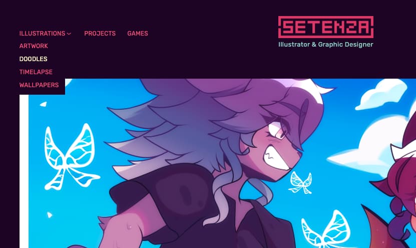
- https://setenza.art/ – This site had plenty of unique identity while being clean, concise, and easy to use.
- https://yenshuliao.com/ – While this site seems to have an issue with navigation being readable while scrolling, I really appreciated how in depth the artist made each item, showing their whole process.
- https://vespervines.com/ – So often I see black background or “dark” sites that go all in on black and white and still look very amateur. This site definitely uses the right amount of black, white, green, and a light blue to make it look very unique and polished.
- https://nalvali.com/ – Shoutout to a fellow sidebar navigation portfolio!
- https://www.madeleinefjall.com/ – I liked that this site was relatively straightforward and simple, but the addition of the background element was a nice touch.
- https://jpawlik.com/ – The color identity of this site drew me in right away. It’s super playful and unique.
Hope this information helps you shine up (or build!) your portfolio page. Let me know what you found most useful in the comments below!